
With the Minnesota Twins releasing their lake-inspired, rippled blue alternate jerseys this week, we have officially reached the end of the City Connect road. In 2021, Nike and MLB began their journey of unveiling new uniform sets for the entire league, one team at a time. Now, more than three years after the Boston Red Sox “went full banana,” we’ve finished that first cycle.
Teams will be rethinking and re-releasing as time goes on; merch makes money, and money makes the world go ‘round. But for now, we can sit back and rate, grade and rank all the shiny, new threads we’ve gotten over the past three seasons.
Worth noting: Only two teams don’t have City Connect uniforms — the New York Yankees and the Oakland Athletics — and neither will be getting a set anytime soon.
Call it tradition, call it snootiness, but the Yankees and their 27 World Series rings aren’t going anywhere near an alternate home uniform. The Bombers have been pinstripes-only in The Bronx since 1915, and there’s probably nothing Nike or the league can do to convince owner Hal Steinbrenner and other team brass to get funky.
The A’s, meanwhile, are literally disconnecting from Oakland at season’s end after 50-plus years in the East Bay. They’ll be spending three years as guests in Sacramento’s Triple-A stadium before migrating to Las Vegas in 2028 … at the earliest. This team’s leadership has proven itself inept time and time again, and it would be shocking to see a city-focused uniform before the A’s move to the desert.
For now, forget them. Let’s focus on the first 28 uniforms.
What makes a good City Connect set? For me, three main things:
-
It actually has to look good. I don’t care how much the shirt embodies the grit of your city if it’s an ugly shirt.
-
It has to look distinct from both the team’s other uniforms and other uniforms around the league.
-
It should coherently relate to or tell the story of the local area.
Here are my definitive City Connects rankings, which are objectively correct and entirely unimpeachable.
Debut: Aug. 20, 2021
Verdict: These are spring training tops with blue pants that look like knockoffs and bring up memories of a certain late-’90s dance tune. Even worse, they don’t connect to the city. There are no little touches, no cutesy flourishes, no hidden meanings. And besides the “Los” on the chest, a lazy nod to the city’s Latin roots, there’s nothing distinctly L.A. about these. What a missed opportunity for a city that has so much to pull from. This is far and away the worst City Connect — so bad that the Dodgers will be unveiling a “whoopsie-daisy, can we get a redo” set at some point this season.
Grade: F
Debut: July 9, 2021
Verdict: Big meh. The fog motif and the bridges on the sleeves are fun ideas, but these uniforms fail at the most basic task: looking good. There’s way too much white, which works poorly with the zippier-than-normal shade of orange. For whatever reason, I have faith that San Francisco‘s next attempt will land much better. It’s too interesting of a city to fail twice.
Grade: D-
Debut: June 12, 2021
Verdict: They look fine, but there’s a reason the Cubs haven’t worn these yet in 2024. The lettering on the chest is really squeezed in there, and there are too many other distinguishing features besides the navy pants. In all, it’s a tidal wave of underwhelming. This set also fails at connecting to the city. While the Cubs made reference to all 77 of Chicago’s neighborhoods in the uniform’s roll-out, the actual threads don’t carry that forward. Instead, they connect to a very specific, relatively interchangeable neighborhood within an enormous, vibrant, multicultural city. Make ’em out of actual ivy next time; itchy but different.
A fan’s take: “I feel neutral. Don’t love, don’t hate. But I guess neutral is bad for City Connect. They should be a little more out there. So it’s a missed opportunity.”
Grade: D
Debut: April 8, 2023
Verdict: These look good, and all the little nods to Hank Aaron are lovely, but the uniforms themselves fall short. They aren’t bold enough, and they don’t convey anything about Atlanta. These are just ‘70s era-inspired throwbacks with a few Hank Aaron-related tweaks and “The A” plastered onto the chest. Nice-looking threads but far too reliant on Atlanta’s preexisting visual language. It was a great announcement video, though. Ludacris getting out of a helicopter on the outfield grass at Truist Park? No notes on that.
A fan’s take: “Too similar to their ‘70s/‘80s throwbacks. They played it very safe, which I will not give them credit for.”
Grade: C-
Debut: May 26, 2023
Verdict: These uniforms aren’t bad. They aren’t ugly. You could wear this, and nobody would tackle you for sartorial ineptitude. But they are remarkably boring. A black top with white block lettering that just says “BALTIMORE” isn’t moving the needle, even if there is the wacky, polychromatic pattern underneath. The theme of these threads — that people think Baltimore is straightforward but complex under the surface — is something of a sad self-own that doesn’t give the city enough credit.
Grade: C
Debut: May 5, 2023
Verdict: I have two main problems with these uniforms: (1) They just look like throwbacks. (2) The black pants are bad. The tops alone are pretty, but the entire ensemble doesn’t do it for me. I think Seattle could’ve been a bit more imaginative here than simply harkening back to an older uniform.
A local’s take: “I like them, but it’s not the first Mariners jersey I would buy. The black pants are a little bit weird, but the tops are cool.”
Grade: C
Debut: May 25, 2024
Verdict: Unimaginative but solid. The Cardinals stayed within their own color scheme, a low-risk, low-reward approach that went a step further by keeping the “birds-on-the-bat” across the chest. The red tops are new for an organization that has worn red tops only in spring training, but it’s far from groundbreaking. That said, these rep St. Louis well; “The Lou” is a thing people from The Lou call The Lou, as silly as it might sound to an outsider, and the river-resembling pinstripes as a shoutout to the city flag are pretty sweet. But the hats, with that painfully simple “STL,” absolutely stink. That said, these uniforms did give us the unforgettable moment of Cardinals shortstop Masyn Winn sharing his way-too-honest take on the uniforms.
A local’s take: “I love the red tops, the subtle river pinstripes and the red piping on the white pants. While the birds on the bat is classic, I wish they would have done something different across the chest.”
Grade: C
Debut: April 12, 2024
Verdict: Every piece of merch associated with the Phillies’ City Connect motif — the hats, tees, sweatshirts, etc. — absolutely rules. That is, except the actual uniform. The colors, meant to reference the city’s flag, were a bold choice but feel too disconnected from the city itself. Maybe I’m a hater, though, because kids in Philadelphia absolutely love these. Go to any Phillies game on a Friday, when they’re in the black and teal, and you’ll see so many kids rocking these.
A fan’s take: “They just completely missed the mark. It leaves a lot to be desired. There are some great parts to get behind, but what loses me every time is bringing in the city flag for the color representation. Nobody in the city connects with it, and it feels like it was a lazy attempt to make it ‘Philly.’”
Grade: C+
Debut: May 10, 2024
Verdict: The hat, which simply spells out DETROIT in big, block font on a navy background, is an abomination because Detroit’s “script D” hat is a recognizable classic. The car-themed uniforms are a both apt and overwrought hat tip to Detroit’s role in the auto industry. The small details on the sleeves are fun touches, but this uniform lacks a pop of color. Also, it kind of makes it look like Matt Vierling, or whomever, got run over by a cartoon truck.
Grade: C+
19. Minnesota Twins
Debut: June 14, 2024
Verdict: The jersey tops are fabulous. That gradient-blue ripple pattern is distinct and easy on the eyes, but the royal blue pants remind me of a naked member of the Blue Man Group. I would love these if they switched to white or navy pants. The hat with the “Land of 10,000 Lakes” stitching is awesome, and overall, it’s a distinct look compared to the rest of Minnesota’s uniform set. That said, the color combo, at first glance, feels like either a Tampa Bay Rays alternate uniform or a Mariners throwback. It’s also worth noting that there are only 13 major lakes within Minneapolis and 11 within St. Paul. That leaves 9,976 lakes, which makes this more of a state connect.
A local’s take: “They’re kinda cool? Not Minnesota enough. They should have been purple.”
Grade: C+
Debut: May 31, 2024
Verdict: The Jays are a victim of chronology here. If the Blue Jays’ uniforms had been the first all-black City Connects instead of the last, people would have been more excited. That said, I like the color scheme as a subtle nod to the Blue Jays’ odd 21st-century uniform history. The hat is particularly great; it’s both different from any other Jays lid and very clearly a Toronto Blue Jays hat. Bonus points for being the only team to put the whole skyline on the jersey. As an American-based homebody, I cannot speak to the vitality of Toronto’s nightlife, but they can legitimately say, “Our city is on our chest.”
Grade: B-
Debut: June 27, 2023
Verdict: Sure! Fine! The epitome of sufficient! The Pirates had to stay within the Pittsburgh-ian world of black and gold, which sort of limited their creative room to roam. This is a solid, respectable effort within that constraint.
A local’s take: “The main issue is that the normal jersey colors and themes are so Pittsburgh already that it’s hard to think of something new. ”
Grade: B-
Debut: April 21, 2023
Verdict: Hate ‘em or love ‘em, there’s no doubt that the Rangers wear these uniforms. Texas’ City Connects are perhaps the most unique and polarizing in the league. The colors — navy bottoms and cream tops with red lettering — are unique, as was the organization’s decision to create its own mythical creature — a peagle, a combo of an eagle and a panther — to pay homage to the region’s professional baseball history. (The Dallas Eagles and Fort Worth Panthers were two of the area’s original teams.)
Grade: B
Debut: April 27, 2024
Verdict: Solid showing. These look nice, make a bunch of good NYC references (the 7 train’s shade of purple is great) and try to tell a distinct visual story. Throwing NYC across the chest feels like a stirring-of-the-pot move directed toward their crosstown rivals, who are too cool for City Connect school. Hopefully the next rendition goes harder on the purple; the gray is dull, which makes the whole set lack pop. Oh, and the hat is whack.
Grade: B
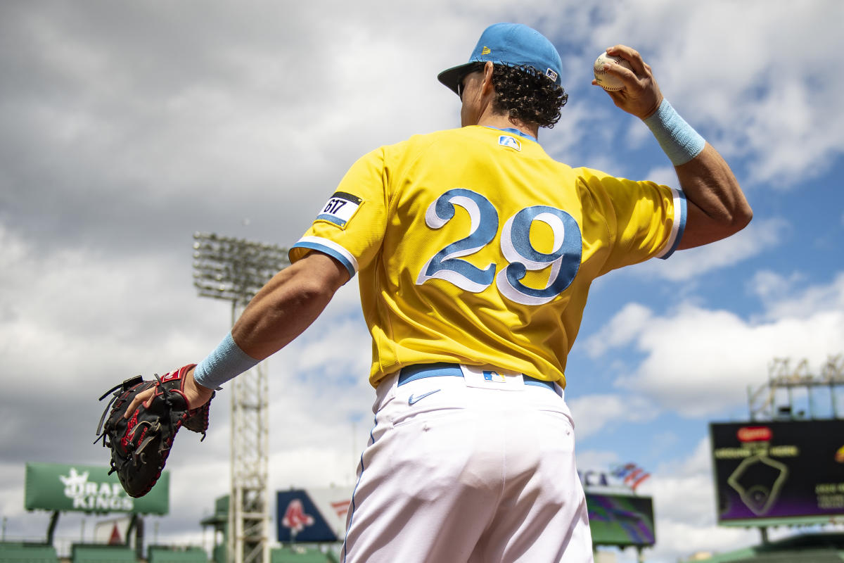
14. Boston Red Sox
Debut: April 17, 2021
Verdict: Remember, the Red Sox went first. They were the Neil Armstrong of City Connects. One small step, etc. Good on them for being willing to make the leap. I certainly wouldn’t call these threads beautiful, but the jerseys are more about the meaning behind them — a hat tip to the colors and themes of the Boston Marathon — than the actual look. People in Boston love them, understand them and wear them all the time. And, most importantly, they don’t give a hoot what anyone else thinks.
Grade: B
Debut: June 11, 2022
Verdict: These uniforms look great, which is often the point of clothing. The cream tops are lovely, the three-panel hats work, and the big-bubble uniform font is very SoCal. Its job is beach. It makes me want to buy a VW van and learn how to surf. But these look more like Angels alternates than a bold rethinking of the identity. Still, when the Halos are forced to get new City Connects, they could and should keep these as a regular set.
Grade: B+
Debut: May 19, 2023
Verdict: The Reds were the team most focused on the future, an interesting choice for baseball’s oldest franchise. Buzz words such as “future,” “modernized,” “vision” and “next” dot the description of the unis. It’s a strategy that works, taking a history more than 150 years old and spinning it forward. The names and numbers can be a bit difficult to read from afar, and the hats are just OK, but these are good. Random thing: Whenever I talk to players about City Connects, a notable number reference how much they like the Reds’ version. Sure!
Grade: B+
Debut: April 30, 2022
Verdict: Crisper than a late-night (illegal) splash into the Kauffman Stadium fountains, these navy Royals City Connects essentially TKO’d the similarly colored Cubs ones, thanks to more details and a more inspired logo.
A local’s take: “The more crappy City Connects that come out, the happier I am with ours. Combining the fountains with the crown vision shape is legit iconic to me. Also, [Bobby Witt] Junior’s walk-off slam last year was in the Connects, and I think that was a turning point for the franchise, so you’ve got the most iconic Royals moment in the last eight years in that kit.”
Grade: B+
Debut: June 24, 2022
Verdict: Wisconsin in the summer is all about grillin’ out with a beer in your hand, which makes these chillin’ and grillin’ unis a swell fit for the team literally named after suds. The half-baseball, half-grill logo is a thing of beauty.
Grade: B+
Debut: April 20, 2022
Verdict: The Astros checked my three main boxes. (1) The uniform looks pretty nice. (2) The uniform looks different. (3) The uniform references something important to the city.
A local’s take: “I think you have to balance a jersey that ~looks good~ and is also meaningful to the city. I think the Astros’ does both pretty well.”
Grade: B+
Debut: June 18, 2021
Verdict: The desert sand makes these look different from both Arizona’s other uniforms and all the other uniforms in MLB. Using the Spanish “Serpientes” across the chest was a nice call, and the font is very … snake-y, but these are a smidge bland and lack the smaller touches. Arizona has a very over-the-top uniform history, so maybe playing it safe was the smart move. Also, getting David Peralta into the actual desert for the promo video was awesome.
Grade: A-
7. Tampa Bay Rays
Debut: May 3, 2024
Verdict: The Rays organization clearly had a GREAT time designing these, and that comes across through the look. The all-gray, dark-colored motif doesn’t stand out compared to all the other dark City Connects we’ve gotten in 2024, but Tampa clearly has the best of the bunch.
A local’s take: “The skater Ray and the SkyRay [Skyway Bridge Ray] are amongst two of the best secondary logos I’ve ever seen. They’re so fun and unlike anything else that they alone made the unis a massive win for me. The teams that really went out of their typical design scope and comfort zones are the ones that did this campaign right.”
Grade: A-
Debut: May 17, 2024
Verdict: Easily the best of this year’s batch, the Guardians’ alternate threads don’t stray too far from the team’s usual color scheme, but the subtle differences are just enough to make these pop. The light tan, sandstone shade for the pants looks great and was a nod to the “Guardian of Traffic” statues that sit on the Hope Memorial Bridge just outside Progressive Field. Cleveland didn’t take a massive swing with these, but they nailed the execution.
Grade: A
Debut: June 5, 2021
Verdict: Staying within the Sox’s iconic black-and-white color scheme but adding a new twist to the look works great, as does putting Southside across the chest. The only problem is that now I have Tony LaRussa falling asleep in the dugout in these uniforms embedded into my brain.
Grade: A
Debut: June 4, 2022
Verdict: These are beautiful, unique and capture the outdoorsiness of Colorado perfectly, even though it’s a bit funny that the initial inspiration was the state’s license plate. No other team in baseball — or major American pro sports, for that matter — uses this shade of green as a primary uniform color, and there’s just enough dabs of purple to link things to the Rockies palette. Ditching the pine green pants, which the Rockies were using originally, for white pants was the right move.
Grade: A
Debut: July 8, 2022
Verdict: The colors are certainly out there and give off some neon-Barbie energy, but I’m a fan of it all. Unless there’s another club with a mint/hot pink/banana color scheme out there that we don’t know about, the Padres are one-of-one. And that rules. The only things keeping this from being 10/10 is the all-too-common all-white look and the mint/pink hat that looks like something you would find in the clearance section at a Lids. Also, the three unique shades are meant to draw from imagery common on the Baja peninsula, which stretches from San Diego well into Mexico. Connecting two countries within a city is a cool concept. The Padres’ City Connect is inching toward iconic status among 10-year-old little leaguers. Add some pit vipers and a Giannis or Kyrie sneaker, and you’re set.
A local’s take: “I personally love them. Once we learned that it was meant to incorporate the sunset and the ocean of the Southern California/ Mexican beaches, I was all-in. My response to people that hated them were ‘Yeah, these aren’t for you. They’re for Fernando Tatis Jr.’”
Grade: A
2. Washington Nationals
Debut: April 9, 2022
Verdict: Lovely, just lovely. The attention to detail on the Nats’ cherry blossom alternates is really impressive, from the flower petal stitching on the hats to the subtle pattern on the uniform tops. They tell a distinct story about D.C. and deliver a much subtler, though still bold, City Connect look. The powder gray is a little snoozy from afar, but that’s the only bad thing I have to say about these.
A local’s take: “The cherry blossoms? Love the concept, wish the base wasn’t that dark gray color. That said, I like ours much better than most/all the others.”
Grade: A+
1. Miami Marlins
Debut: May 21, 2021
Verdict: Perfection. The story, the look and the connection to the city all hit. These eye-popping uniforms are a tribute to the Cuban Sugar Kings, an affiliated minor-league team based out of Havana, Cuba, in the late 1950s. The Marlins took that unique color palette — electric red and bright teal — and remixed it. They look so different than any other MLB uniform but still have a link to the Marlins’ other threads, thanks to the presence of teal. The decision to use the Sugar Kings as inspiration was a great way to honor Miami’s Cuban population. These are what City Connects are supposed to be: bold, interesting and exciting.
Grade: A+